Visualizing The Customer Lifecycle With Tableau
In an earlier article we learned how to write a SQL query to classify orders into new, active and lapsed customer segments.
In today’s post we’ll learn how to use Tableau to visualize and explore our customer data set.
Annual Customer Counts
Lets start off with a high level annual trend to understand if this business is growing it’s customer file.
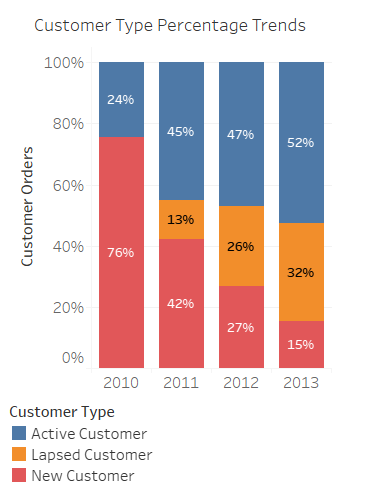
It looks like this business either started in 2010, or this is as far back as the data set is available considering the high new customer count in 2010. A positive sign is that the active customer file is increasing each year, despite the new customer count showing annual declines. It’s also interesting that the lapsed customer count, or customers taking longer than a year to repurchase is increasing.
First Product Category Purchase By New Customers
Remember this data set had a “Customer Segment” indicator for corporate, small business and consumer customer classifications. Perhaps there are insights into which product categories drive new customer purchases.
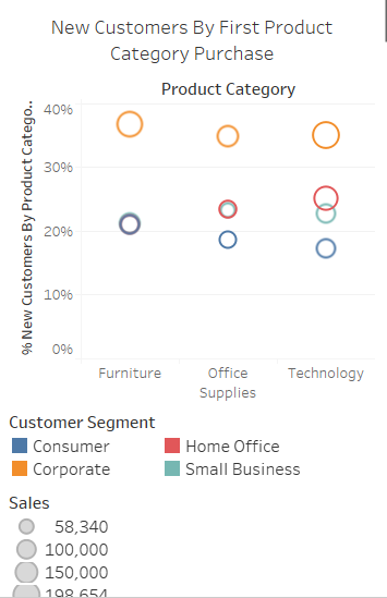
Interesting. The new corporate customers for this business appear to buy across the three product categories at a similar rate. However, the Consumer Segment is more likely to make a first purchase in the Furniture category, while the Home Office customer segment is more likely to begin with a Technology category order.
This insight could have interesting applications for marketing messaging. For example, if the Consumer Segment or Home Office Segments use particular search queries on Google, the marketing team could tailor paid search text ads more appropriately.
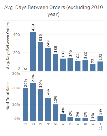
Revenue Contribution Between New & Existing Customer Orders
Over a three year period this business is driving 80% of sales from re-purchases across the active and lapsed customer base. Almost a quarter of sales are coming from the 2nd purchase, yet the average days to the 2nd order is 429 days.
Meanwhile, the average time to 2nd purchase varies by customer segment with the consumer and small business segments taking less time to make the next order. This might suggest the need for different messaging cadence and frequency in marketing geared toward generating the 2nd purchase by customer segment.
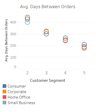
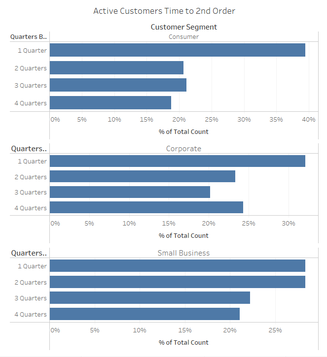
Filtering the time to 2nd transaction by active customers and segment is even more instructive.
- Nearly 40% of the new customer Consumer segment that become active place the 2nd order within the 1st quarter after first purchase.
- 56% of the new customer Small Business segment that become active place the 2nd order within 2 quarters after first purchase.
Knowing the above a messaging cadence strategy for marketing to new consumer segment customers for 2nd purchase should be more aggressive in the first 3 months after purchase. Meanwhile, both the Small Business and Corporate customer segments messaging cadence can be less frequent and spread out over the two quarters after the initial purchase.
I hope you enjoyed the data visualization session. It’s not an exhaustive analysis, yet it demonstrates the power behind combining SQL and Tableau for mining your customer data.
Link to the public Tableau workbook is below.